Ecommerce10 min read
Amazon A+ Content: What It Is and When It Pays
A+ Content replaces the plain Amazon description with rich modules — free with Brand Registry, powerful when designed for mobile doubt-killing, wasted as decoration. What it affects, which modules earn pixels, and when the effort pays.
BurTech Solution
Engineering team

A+ Content is Amazon’s name for the rich, modular product-description section available to brand-registered sellers — the image banners, comparison charts and formatted story blocks that replace the plain-text description on a listing. It costs nothing to use, requires Brand Registry to unlock, and sits in a strange strategic spot: routinely credited with meaningful conversion lifts, routinely produced so badly that it delivers none of them.
This guide covers what A+ actually is (and its Premium tier), what it demonstrably does and does not affect, which modules earn their pixels, how to design content that survives mobile — where most of it is viewed — and when the effort pays against the alternative uses of the same design budget.
What A+ Content actually is
On a standard listing, the “Product Description” area is plain text. With Brand Registry, Seller Central’s A+ Content Manager replaces it with a canvas of modules — image headers, four-image-with-text grids, comparison tables, standard text blocks — assembled per product (or applied to families via ASIN groups). Basic A+ is free and covers the modules most brands need. Premium A+ (“A++”) — larger modules, video, carousels, Q&A blocks — unlocks for brands meeting Amazon’s current criteria (historically tied to Brand Story adoption and A+ coverage; check Seller Central for today’s rules, which shift). The Brand Story band is a separate, additional strip — use it for the brand, keep A+ for the product, and do not let either duplicate the other.
The honest ranking note up front, because agencies blur it: Amazon has stated A+ text is not indexed for search the way titles, bullets and backend keywords are. A+ can lift conversion, and conversion feeds ranking indirectly — but nobody should sell you A+ as a keyword play. Its job is persuasion after the click, and everything below optimises for exactly that.
A vocabulary check before the modules, since Amazon’s naming sprawls: “A+ Content” (Seller Central, Brand Registry sellers) and “A+ Detail Pages” (Vendor Central’s ancestor of the same thing) have converged in practice; “Enhanced Brand Content (EBC)” is the retired old name you will still meet in dated guides; and “Premium A+” is the upgraded tier, not a paid subscription. If a consultant quotes you for “EBC,” their playbook may be equally dated — a useful tell.
What A+ demonstrably affects
Amazon’s own materials cite average sales lifts in the mid single digits for Basic A+ (commonly quoted “up to 8%”) and higher for Premium (“up to 20%”) — vendor-published averages worth treating as directional, not promised. The mechanism is concrete and observable in your own funnel: shoppers who scroll past the bullets are the doubtful ones, and A+ answers doubt visually — the size worn on a person, the compatibility chart, the durability demonstration — at the exact moment text alone starts losing them. Secondary, quieter effects: fewer wrong-expectation returns (the same honesty dividend as good description copy), fewer repetitive pre-sale questions, and a listing that reads as brand-serious next to competitors’ plain text — which matters most in categories full of near-identical items.
The modules that earn their pixels (and the ones that don’t)
Earners:
- The benefit banner: full-width image, product in honest use, one short overlay claim (“24-hour cold. Zero condensation.”). It restates the purchase’s core promise visually — the A+ equivalent of the fold.
- The comparison chart: your own product range side by side (sizes, tiers, use cases). It answers “which one for me” and quietly cross-sells — the single highest-utility module for brands with a family of SKUs, and it keeps the shopper inside your catalogue instead of comparison-shopping competitors.
- The objection grid: the four-image-with-text module, used as four doubt-killers — fit, durability, compatibility, care — one each, photographed as proof rather than decorated as mood. Source the four doubts from your actual reviews and Q&A; they are sitting there, ranked by frequency.
- Spec-with-lifestyle hybrids: dimensions on the product in context (the bottle in the cup holder, the bag under the airline seat) — numbers made visual, which is how numbers persuade.
Wasters: mission-statement banners (the brand story band exists for that), text-heavy paragraphs restating the bullets (nobody scrolled for a re-read), decorative lifestyle collages claiming nothing, and any module whose baked-in text is unreadable at phone width — which is most text baked into images at less than banner size. The test for every module: which specific doubt does this kill? No answer, no module.
Design rules: mobile first, honesty always
- Preview on a phone before publishing. Modules stack single-column on mobile; a comparison chart designed for desktop width becomes a horizontal scroll or a squint. Amazon’s preview shows both — believe the mobile one, because that is where the majority of traffic lives.
- Overlay text: short, big, high-contrast. Six to ten words per banner claim; if the message needs a paragraph, it belongs in a text module, not baked into pixels where zoom and screen readers cannot reach it — and where Amazon’s image-text moderation can reject it.
- Photography over decoration: the same rules as print and first screens — one focal point per image, real product, consistent grade across modules so the section reads designed.
- Claims survive compliance: A+ passes moderation, and category rules (supplements, topicals, anything medical) reject superlatives and unverifiable claims. Write claims your label supports — the same overreach discipline as everywhere else, with a rejection queue as the enforcement.
- Alt text fields exist — fill them. Accessibility, and the only machine-readable layer of your image content.
The production path that scales
One-off A+ per hero product is an afternoon; a catalogue needs a system — the same shape as description production: a module template per product family, brand-consistent image treatments, claims pulled from the attribute source of truth, and human review before publish. Build the hero products bespoke, template the family, and reuse ruthlessly — the four-doubt grid for one sock differs from the next mostly in photography. This is exactly the listing-image production we run for clients like Factory Direct Medical, where the gallery images and the A+ modules ship as one coordinated set — because to the shopper they are one argument in two places.
A module-by-module worked build
Theory into pixels — here is the full A+ plan for a familiar example, a 20-30mmHg compression sock aimed at nurses and travellers, exactly as we would storyboard it:
- Banner one (promise): the sock worn mid-shift in a real corridor, overlay: “Support that lasts the whole twelve hours.” One claim, one image, sets the frame.
- Objection grid (four tiles): “Goes on without a fight” (hands demonstrating the roll-on technique) · “Stays up, no pinch” (cuff close-up on a real calf) · “Breathes through long-haul” (fabric macro with airflow annotation) · “Survives the wash” (care icons over a laundry shot). Each tile is a top review-question, answered with evidence.
- Comparison chart: the brand’s three compression levels × five rows (support level, best for, sizes, materials, care). The nurse buys correctly; the traveller discovers the lighter tier exists; nobody leaves to research competitors.
- Banner two (fit trust): the size logic visualised — calf measurement diagram with honest guidance (“between sizes? size up”). Returns’ biggest cause, addressed with a picture.
- Standard text block (short): the two-sentence liftable summary from the description system, plus the guarantee. Machines and skimmers both served.
Five modules, one argument, every element traceable to a doubt in the review data. Build time with a photo library in hand: a day for the hero, an hour per sibling SKU from the template. That traceability — doubt → module → evidence — is the entire method; the aesthetics are just its uniform.
Sequencing: the gallery does the heavy lifting first
Strategic order matters because budgets are finite: the image gallery (main image plus the six-to-eight secondary tiles) is seen by everyone — including the majority who never scroll to A+ — and it is where the buy decision usually happens. A+ is the second act for the doubtful scroller. The rational sequence for a brand building its listing assets: 1) main image optimisation (click-through from search), 2) gallery infographic and lifestyle tiles (the conviction layer, per the listing-image playbook), 3) A+ for hero products (the doubt layer), 4) A+ templated across the family, 5) Premium A+ if eligibility and category competition justify it. Brands that build A+ before fixing a weak main image have decorated the second floor of a shop nobody enters.
The Brand Story band, used properly
Because it ships alongside A+ and gets confused with it: the Brand Story is the horizontal scrolling band above the A+ section, built from its own card modules, and its job is portfolio-level — who the brand is, what the range covers, links to your storefront and other ASINs. Used well, it is your catalogue’s cross-sell rail on every listing: a brand card (one sentence of positioning — the same sentence as your llms.txt blockquote, because entity consistency includes marketplaces), followed by category cards routing to your storefront’s shelves. Used badly, it is a second mission statement eating the space. The division of labour in one line: Brand Story sells the shop; A+ sells the shelf’s product; the gallery sells the click. Three layers, three jobs, zero duplication — and a shopper who bounces off one product but likes the brand has a marked path to the rest of your range instead of the search results.
Common rejection reasons (save yourself the resubmission loop)
A+ passes human/automated moderation, and the recurring rejections are predictable: pricing or promotion language anywhere (“sale,” “free shipping,” dollar signs); competitor references, explicit or implied (“unlike other brands”); unverifiable superlatives (“best,” “#1” without an authorised badge); prohibited claims in regulated categories (anything therapeutic without approval — compression’s “medical grade” phrasing walks this line and should track your compliance guidance); contact information or off-Amazon URLs; and low-resolution or watermarked imagery. Draft with the list beside you and approval is boring — which, in marketplace operations, is the goal state for everything.
Measuring whether A+ paid
Amazon gives you enough to be honest: conversion rate (unit session percentage) in Business Reports, compared across the weeks before and after A+ ships — same cohort caveats as any CRO reading (seasonality, price changes and ad spend distort single-week reads); the Manage Experiments tool, which for eligible brands runs actual A/B tests of A+ versions — the gold standard when available, use it and stop guessing; and returns and pre-sale questions trending down on treated ASINs — the honesty dividend, visible within a quarter. Expect the lift to concentrate on considered products; a commodity consumable with a perfect gallery may show little A+ delta, which is itself useful budget guidance.
The off-Amazon dividend
The best argument for doing A+ properly is that almost none of the work is Amazon-specific. The doubt inventory mined from reviews powers your DTC product page’s objection blocks; the comparison chart becomes your site’s “which one is right for me” module; the photography feeds the gallery, the site, the recovery emails and the social templates; and the claims discipline — label-supported, superlative-free — is the same one that keeps every other surface safe. Meanwhile the consistency itself compounds: AI shopping assistants cross-reference your Amazon presence against your site’s structured product data, and matching facts across surfaces is corroborating evidence, while contradictions quietly cost trust on both. Budget A+ not as a marketplace chore but as the visual half of one product-content system — built once, published everywhere your products live.
When A+ is the wrong spend
Completeness demands the negative cases. Skip or defer A+ when: the main image and gallery are weak (fix the layer everyone sees first — always); the product is a pure commodity consumable bought on price and Prime badge, where doubt barely exists to kill; the catalogue is churning (seasonal SKUs cycling faster than content can amortise — template or skip); or Brand Registry is blocked (unresolved trademark — fix that first, it unlocks far more than A+). And one strategic caution: brands whose entire business lives on Amazon should weigh every marketplace-content hour against building any owned channel at all — A+ improves a shelf you rent; a store you own compounds. The strongest operators do both deliberately, with eyes open about which asset appreciates.
Who should build it — in-house or agency?
The storyboard needs whoever knows the customer’s doubts (support, the founder, review data); the production needs design hands and marketplace-spec fluency. Small brands with one hero product can absolutely self-build in Amazon’s editor from this article’s method. Catalogues, families and Premium tiers reward the systemised approach — template, photo standards, compliance checklist — which is where outside production earns its fee. Either way, own the source files and the doubt inventory; the vendor may change, but the argument is yours.
The bottom line
A+ Content is free real estate for killing doubt visually — and only that. Unlock it with Brand Registry, spend it on benefit banners, comparison charts and objection grids designed for a phone, measure it with experiments where you can, and sequence it after the gallery that everyone actually sees. Treated as decoration it returns nothing; treated as the second act of one continuous sales argument, it is the cheapest conversion asset on the marketplace.
Frequently asked questions
Does A+ Content help Amazon SEO?
Not directly — A+ body text is not indexed like titles and bullets. Indirectly, yes: better conversion strengthens ranking signals, and lower returns protect account health. Fund keywords in the indexed fields; fund persuasion in A+.
Is Premium A+ worth chasing?
If you qualify without contortions, the larger modules and video demonstrably help considered purchases — use them on heroes. Chasing eligibility as a project makes sense only after Basic A+ coverage and the gallery are already excellent; premium decoration on a weak argument is still a weak argument.
Can I just reuse my website images in A+?
Reuse the architecture — the claims, the doubt-killers, the comparison logic — and re-crop the assets to module dimensions with mobile-legible text. Straight pasting desktop web banners produces the unreadable-on-phone failure that defines bad A+. One message system, surface-specific production.
How often should A+ be updated?
When the product, its objections or its family changes — not on a calendar. The exception: review mining once or twice a year; if new doubts dominate recent reviews, the objection grid has a new job. A+ that answers 2024's doubts in 2026 is a museum.
What is Amazon A+ Content?
The rich, modular product-description section available to Brand Registry sellers — image banners, comparison charts and formatted blocks replacing the plain text description. Basic A+ is free; Premium A+ adds larger interactive modules for qualifying brands.
Does A+ Content improve Amazon SEO?
Not directly — A+ body text is not indexed like titles and bullets. It improves conversion for shoppers who scroll, which indirectly strengthens ranking signals. Fund keywords in indexed fields and persuasion in A+.
Is Amazon A+ Content worth it?
For considered products with real buyer doubts, yes — designed as visual doubt-killers (benefit banners, comparison charts, objection grids) and sequenced after the image gallery everyone actually sees. As decoration, no.
Written by
BurTech Solution
Engineering team
The BurTech Solution engineering team designs, builds and maintains AI automation, ecommerce stores, SaaS and custom software for growing businesses. Everything on this blog comes from work we ship for clients and run ourselves.
Keep reading
More on ecommerce.
Ecommerce10 min read
Product Photography vs Listing Images: What Amazon Rewards
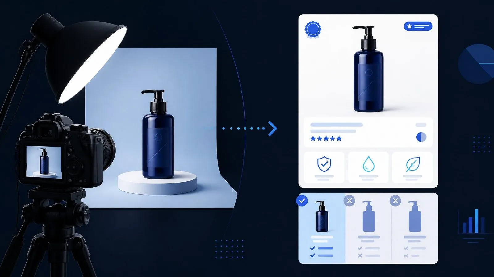
Photography makes a product look true; listing images make it easy to choose. What Amazon actually rewards — the image stack, slot by slot, with the photography baseline, thumbnail-first design rules, compliance lines and how to test with data.
Read the article →
Ecommerce9 min read
Post-Purchase Flows: The Cheapest Revenue in Ecommerce
The customer who just paid you is the cheapest revenue you will ever touch. The full post-purchase machine, flow by flow — confirmations, delivery check-ins, review requests, replenishment and winback — with timing, wiring and measurement.
Read the article →
Ecommerce8 min read
Inventory Sync: Keeping Store, 3PL and Marketplace In Agreement
Oversells happen when three systems each believe they own the stock number. The one-owner architecture, webhook + reconciliation sync patterns, buffer math against overselling, and the habits that survive Black Friday.
Read the article →